CAS Colours & Sketches Color Challenge #453
Hey! Thanks for stopping by my little happy spot. Take a look around and hope you enjoy.
Exciting News!!!! the 2024-2025 Annual Catalog has gone live! Check it out, click on image below for the digital catalog!
OR click HERE to go to the website

Welcome to our 2nd colour challenge of month, Joanne has chosen some fresh, spring-inspired colours for you. Winter just got started for us today in the Southeast with a Winter Weather event believe it or not. My son is in Athens Ga where they are getting heavy wet snow and friends are in Huntsville Alabama where they are getting heavy wet snow, I’m a hour further down the road and simply getting drizzle! Not fair or cool, but gotta roll with it. So very excited to see what this springy, breath of fresh air, color combination inspires you to do. If you are up to it, please do post your creations in our CAS Colours & Sketches Gallery for this challenge.

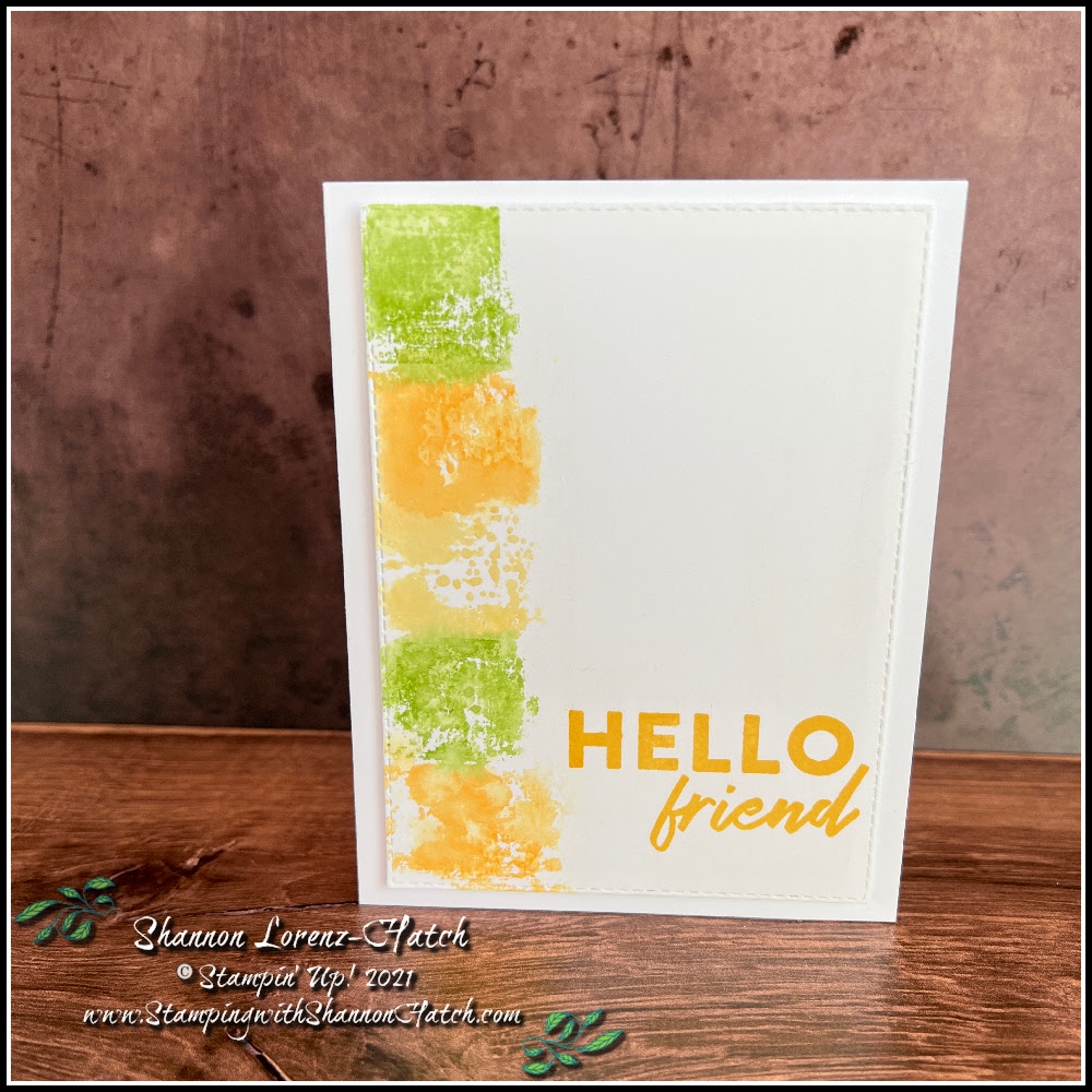
As always seems to be the way for me lately, I have more than one idea. It will actually lead to insanity if I do not at least try to create everything in my head – it spins out of control otherwise. So again, I have a two-fer for you. Very different ideas and techniques. I also came across a bit of a problem….My Daffodil Delight stamp pad seems be identical in color to my Mango Melody stamp pad. Hmmm, could be a cross contamination issue – which, the way this brain works, is a very strong possibility! So to over come that obstacle – in the color smooshing technique I seriously watered down the Daffodil Delight smoosh (in the center) so it does look lighter. To prove that there seems to be an issue here, I stamped the sentiment in Daffodil delight on the color smooshing card – the sentiment looks identical to the color smoothing Mango Melody spots – Hmmm, so operate on the pretense that less is more and the center block is the only Daffodil Delight representative. Mango Melody went hog wild. Granny Apple definitely showed up to play. The other card Mango Melody and Daffodil Delight appear one and the same – I stamped the flower images in the corners with Mango Melody, the splatter dots are Daffodil Delight, yet again they appear the same! So, I took my Daffodil Delight colored pencil and colored in the petals. The pencil clearly shows that there should be a bit more of difference between my two ink pads – clearly Daffodil Delight will need to be replaced. While I enjoyed creating the cards for you and myself – a new challenge presented itself – that made this process even more entertaining! This is simply how my world works….just gotta learn to roll with the punches!


I think the color smooshing has won my heart as a clear favorite of the two – which one is your favorite?
2024-2026 Annual Catalog is now live!

Join my Stampin’ Up! Team and fill your starter kit with 2024-2026 In-Color products for Free through 31 May 2024.

Between 1–31 May, Stampin’ Up! has a fantastic offer for anyone who becomes a demonstrator! Join my team and receive FOUR brand new In Color products in your Starter Kit at no additional cost. These products include:
- 2024–2026 In Color Classic Stampin’ Pad Bundle
- 2024–2026 In Color 8-1/2″ x 11″ (21.6 x 27.9 cm) Cardstock
- 2024–2026 In Color 6″ x 6″ (15.2 x 15.2 cm) Designer Series Paper
- 2024–2026 In Color Stampin’ Write Markers
Altogether, you’ll get the four In Color products, your choice of $125 worth of products, free shipping, and free business supplies for just $99! Being a part of Stampin’ Up!’s creative community also comes with several perks, including early access to products, special discounts, earning product credit, exclusive trainings, demonstrator-only events, and so much more!
As a demonstrator, I am here to help you throughout the join process and beyond. If becoming a demonstrator is something that you are interested in, please reach out! I am excited to answer all your questions and help get you started on your creative journey.
May 2024 Paper Pumpkin Kit

About the Kit:
JULY: Painted Petals
Subscribe 11 June–10 July by clicking here!
Craft beautiful cards with unique watercolor designs and pretty layers!
• Makes 9 cards: 3 each of 3 designs
• Project includes printed cards and coordinating envelopes
• Precut paper pieces and embellishments
• Coordinating colors: Calypso Coral, Gray Granite (Classic Stampin’ Spot), Melon
Mambo, Mossy Meadow, Old Olive
Paper Pumpkin Exclusive July – September Coordinating Add-on Die
Subscribers can also shop the exclusive Every Celebration Dies, which coordinates with April, May and June.
164991 Paper Pumpkin Every Celebration Dies.

Paper Pumpkin Subscription information:
Subscribe to the April Paper Pumpkin Kit between 11 June–10 July by clicking here!
Paper Pumpkin Subscription Options


Shop Online Exclusives – Products NOT found in the catalog

Exclusive and All-inclusive Kits Collection by Stampin’ Up! No Subscription required

Comments
Two gorgeous takes on the challenge colors, Shannon! I just love the artsy look of the first one and the fresh spring atmosphere of the second one. Impossible to say which one I prefer!
Great use of the colours! I’ll try harder to send some of the snow from Calgary to you!
Beautiful cards!! I love them both!